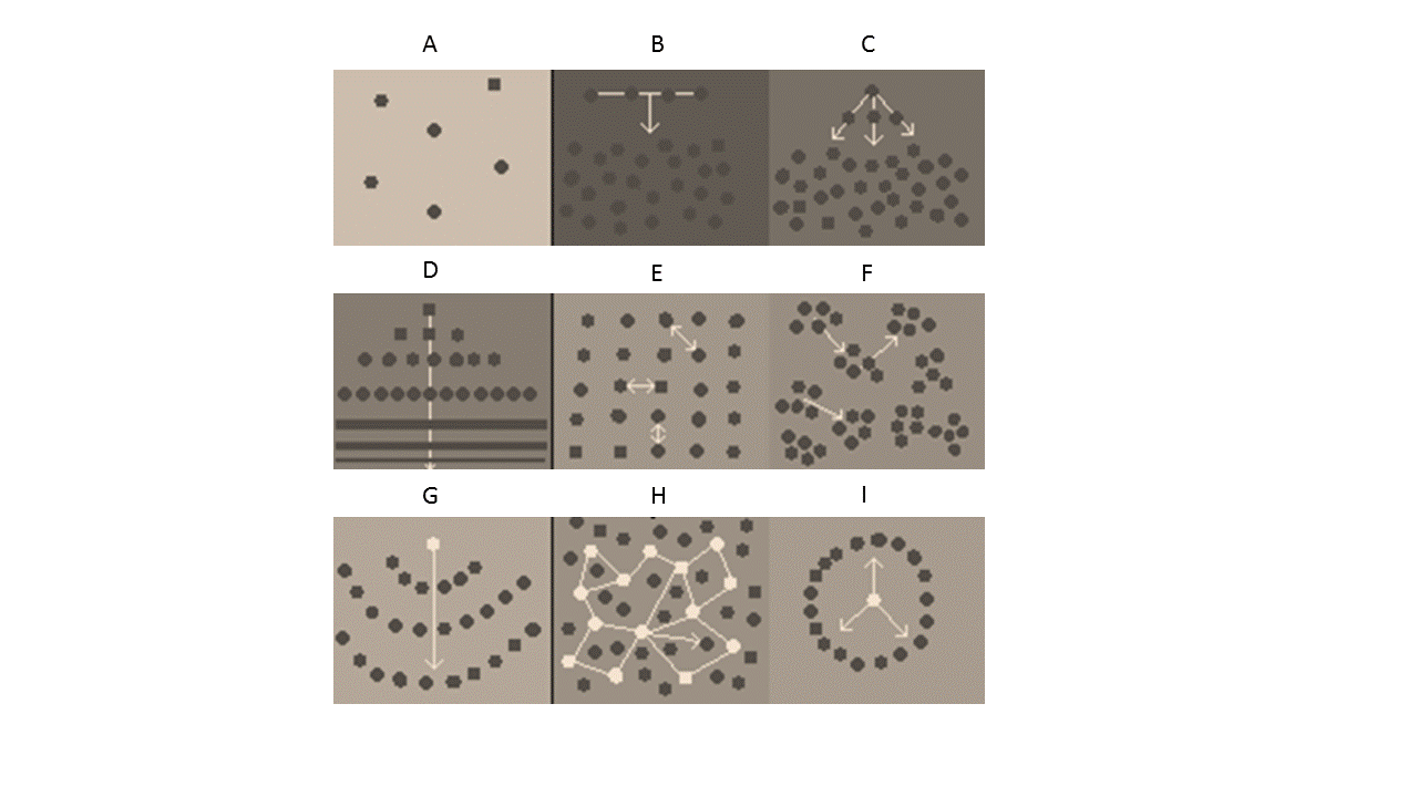
We ran an interesting experiment in the HYPER lab the other day. The following picture was handed to all of the lab members and they were asked to:
- Identify which diagram best describes how work/tasks/information flows in the lab (dots are people, arrows are flows).
- Identify which diagram best describes how things should ideally flow.
The exercise helped change how we communicate. We now have a weekly member lunch and activity on the blog has increased. I’ll leave you to decide on how the image relates to spiral memes.