Now that we have our motivation for an experiment established (Chapter 1), showed that there is a gap needing to be filled in the literature and standards for doing so (Chapter 2), and have a working model connecting what our client cares about to what we are measuring (Chapter 3), it’s time to start experimenting. Give us an introductory paragraph describing how this experimental chapter is organized. Begin with the following section:
4.1 Experimental Setup
The goals of the experimental section are two:
- SHOW that you understand the key components of the experiment and how they work.
- SHOW enough information so that the experiment can be repeated by someone else, somewhere else without having to contact you.
Think about the significance of that for a minute. Have you ever heard about an experimental study where the results could not be repeated/validated? What happens to the credibility of the engineers/researchers who published the report? Have you ever heard about an accident or a near miss where a carefully documented experiment and report saved the engineer’s job? (e.g. They had it right in the report, but a technician cut a corner.) This part of the report, just like careful citation of appropriate standards, can be very important to saving you in a lawsuit or litigation. In Chapter 2 you simply state that the standards cover certain areas. This is the part of Chapter 4 where you SHOW that you are following/conforming to the standards.
Here’s a few good ways to show us you understand the components of an experiment:
- A table of instruments involved in recording the data. Give us the purpose, make, model #, applicable ranges, and uncertainties.
- Diagrams and accompanying pictures of the actual experiment. Potential diagrams include flow, wiring, force, energy, and others. These are commonly called Plumbing and Instrumentation (P&ID) diagrams and are often referred to in incident investigations.
Making good diagrams is a design challenge in itself. One common mistake is to take a picture of your experiment and superimpose numbers/labels over the picture to identify components. This is usually none optimal. There is an old saying, “A picture is worth a thousand words.” I counter that with “Nine hundred of which are irrelevant.” The Google Maps approach to have a layer with just the streets, then another layer to add in the satellite view, is likely the best. For your reports, I recommend having a diagram/schematic view that is accompanied by an actual picture in a similar orientation as your schematic so your reader can quickly go from one to the other.
Our library has a copy of the ANSI/ISA 2009 Instrumentation Symbols and Identification standard. A briefer version is available on the P&ID Wikipedia page. Whatever organization you end up working for is likely to have their own in-house standard protocol for P&ID that you’ll have to follow. There are several software programs, including Inventor, that will automatically make a P&ID for you. In general a P&ID will have the following features: A) Key piping connections and instrument locations/details, and B) Critical safety, control, and shutdown schemes. You should also have a narrative that walks us through the visuals to make sure that we don’t miss the key features/points/takeaways. How you accomplish this is up to you. Some students have done incredible work using Microsoft Visio. Here are a few of the very best examples I’ve seen from over the years:

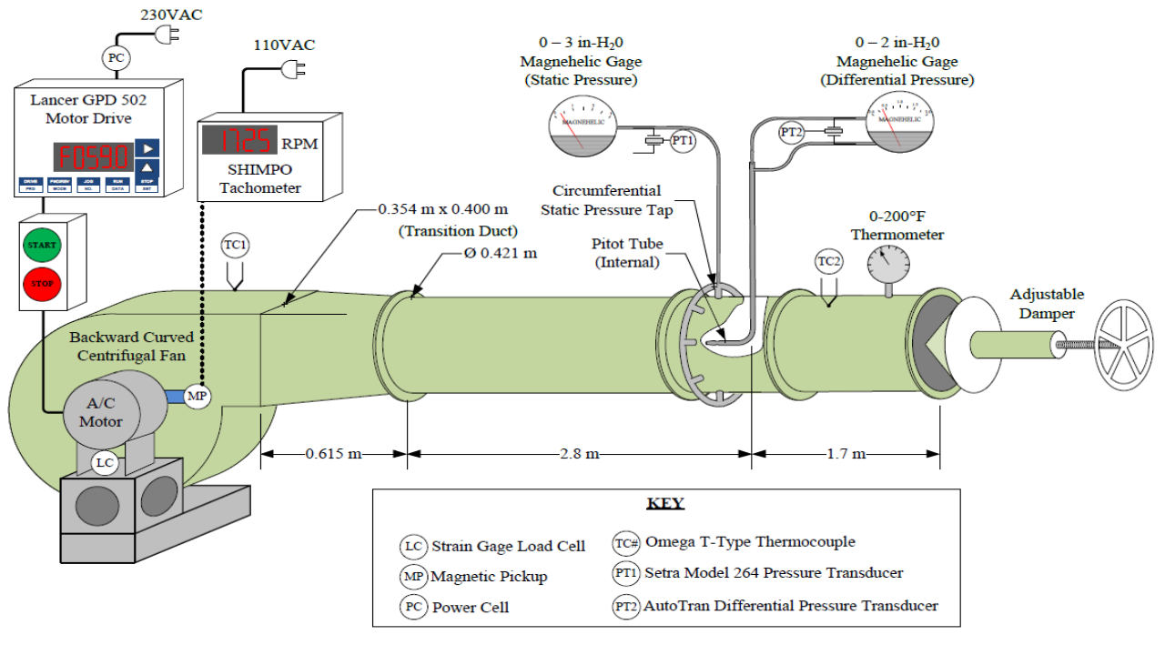
So as you can see, this could take some time to do very well. But once you’ve got a visual like this, it serves as a key feature in your reports, actual experimental info, and presentation. I’ve witnessed visuals like this drop jaws — that’s a lot of political capital in your favor if you can do it to your boss.
4.2 Experimental Procedure
This is a start to finish, step-by-step, enumerated description of how the experiment is started, a measurement taken, the procedure from moving from state-point to state-point, and shutdown. Often these test procedures will be given to untrained technicians for data collection so it’s important that you write it such that nobody can get hurt. You’ll want to use your labeled/numbered experimental diagram from section 4.1 as a reference throughout. Brief, informative, friendly, and firm… Relevant, credible, efficient…
A key oversight in this section is to crassly describe how you will proceed from measurement-point to measurement-point without describing how long you will wait to ensure you’ve achieved steady state, or to not describe how much to vary the experiment between measurement points. Now is the time to plan how long each measurement will take, consider how much time you have to complete the report/project, and then budget your measurements accordingly to maximize value. In other words, you should’ve completed a sample measurement run and have plotted the initial measurements (similar to a product prototype). This will give you considerable confidence that you are budgeting an appropriate amount of time for the number of data points you plan to produce.
NASA and other serious research organizations often want a test matrix and accompanying Gantt Chart describing the timeline for project completion. In such a test matrix you would need to provide a rationale for why you are completing every measurement run to ensure that you were not taking too many measurements, or not enough, and are budgeting an appropriate amount of time.
Next time we’ll cover how we actually analyze and interpret the raw data with quantified confidence/uncertainty.
Before the end of lab time you should:
- Have drafted sections 4.1 and 4.2 of your report, including a plan (outlined above) for the key schematics and enumerated operating procedures.
- Collect your first data point to make sure you know how to analyze it correctly before submitting your technical memo/proposal.
- Take the best paragraph from each of the prior sections and combine these into a five paragraph proposal (the fifth paragraph anticipates the results, why they matter, and concludes with a request to begin testing). You’ll hand this in before the end of the lab time on Tuesday. Here’s a prompt and grading rubric:
Technical Memo Proposal Prompt and Rubric