We’re now to the point where we’ve taken measurements and analyzed our confidence and uncertainties. One of the most rewarding parts of experimental investigations is graphing and visualizing your hard work. Usually this will appear in the Results and Conclusions section of your report.
5. Results and Conclusions
What would someone take away from your report if they only read the introduction and skimmed ahead to the results and conclusions? Make sure you don’t let them miss your most important points and findings! When you skim through something what do you look for? Odds are headings and images.
Why the images?
They’re worth a thousand words… 900 of which are irrelevant. But what do they really tell us?

When you look at the above graph, why have I chosen two y-axes to present both the heat capacities of hydrogen and the equilibrium fraction of spinning vs. non-spinning hydrogen at cryogenic temperatures? Because they are related. Graphs are great at showing how sometimes complex information is related, and changes, relative to another. Graphs compare and contrast.
Many will say that figures are a matter of taste and preference. That’s true to a point. However, you’ll find that good graphics will consistently do similar things. Here’s a few examples:
- What not to do: University of Wisconsin-Madison Professor Rod Lake’s abominable graphs website.
- What to do: here’s a very old standard on graphic design from 1914, but is still very relevant.
In general, the steps for creating quality plots are pretty straightforward:
- Identify the intention for the plot: This intention is likely a good caption for the plot (e.g. A Shear stress versus time plot to show that the precision error in the measurements changed little over all three flow regimes). Ask yourself what, if someone were just skimming, they should take away from this plot/graph.
- Error-proof the plot bounds: Remove any chance of someone taking away the wrong message from the plot. Does each axis have a label with units? Are tick-marks or grid lines used and does each number correspond to a major or minor mark? Does each minor mark correspond to a full unit value of the graph? (e.g. A graph from 0-20 with major marks on each 5 should have only 4 minor tick marks between each major, as 4 is the only number that corresponds to full integer values (1,2,3,4)) Does the number of significant figures on each axis make sense? We wouldn’t want the major values to have 0.001 significant figures if the minor values are only reported every 0.1. Does each axis start on a major value that is enumerated (doesn’t end at an unidentified value in space)?
- Error-proof the data: Is it clear what information is theoretically predicted versus experimentally measured? Use continuous curves without data markers for theoretical predictions and data markers without connecting curves for measurements. Use data markers that come to a point at the true value (like with an x or +) and avoid markers that are ambiguous (like I, O, or –). Are there so many points clustered together that we can’t separate them? Use averaged values instead and change the plotting style from linear to log or some other way to allow the data to show the trends. Is there a legend that connects each data marker to the intended input? Are the marker shapes and colors selected in case the plot is printed in black or white, or a reader is color blind?
- Error-proof the point: Everything else unrelated to the intention of the graph is noise that distracts your audience from the intended purpose of the figure. Make sure someone can’t miss the point — put arrows, lines, and labels in to show them exactly the point that is intended. Remove any duplicative information — do you have a title that is different from the caption?
But you’ll need to practice to get good at it. The example above was of theoretical curves. Notice that they are smooth. The uncertainties in the predictions likely fall within the line-width. Experimental measurements are seldom this easy. The following figure shows some raw measurement traces for when I measured the visco-plastic flow of solid deuterium. You can see in the figures when steady state was achieved at a given temperature, dynamic shear strength, and heat transfer measurement. At these steady state points I can average to obtain representative points.
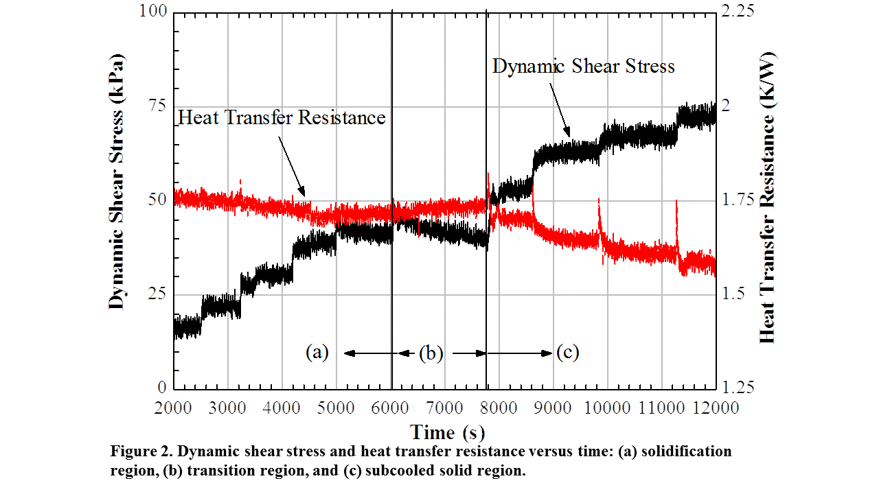
Notice that I use the figure caption to describe what is displayed and do not repeat the information with a title above the graph. These graphs are all made with Engineering Equation Solver (EES). The EES default graph is very clean and tends to work in most situations. Even for very large datasets like the one above. Plotting raw data like this can give people incredible confidence in your experiment. Can you estimate the precision error from the data traces? Does it look like I achieved steady state before moving to another data point?
With these raw datasets, it’s straightforward to average the values to return the points you want to report. Here’s an example with all of the points I measured for my Ph.D. dissertation.
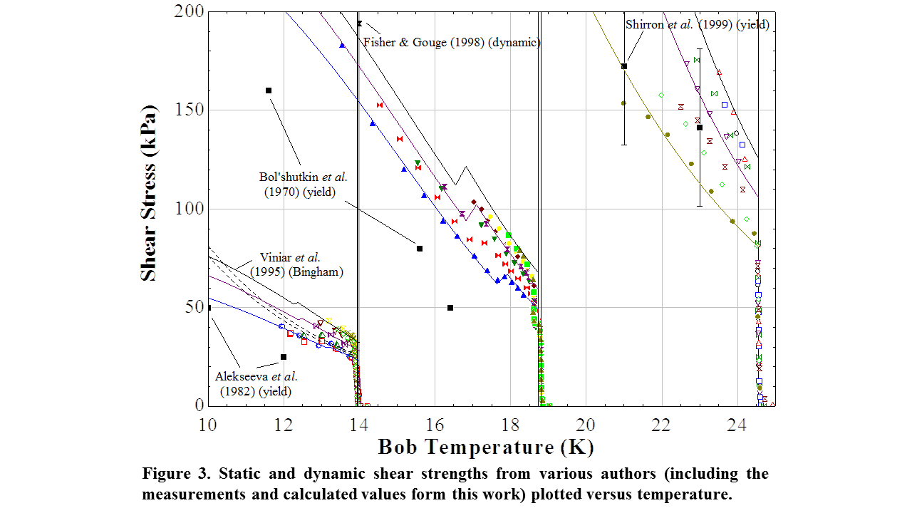 Effective plots can function like maps, really data maps. This one contains the visco-plastic flow measurements for hydrogen, deuterium, and neon. Can you compare and contrast? I even include the prior measurements, some with estimated uncertainty bars. Do the bars add important information when compared to the correlations I developed (colored lines)? What about prior measurements and correlations? When done correctly, effective plots immediately show the value you’ve added through the work.
By the end of the day, you should have completed the following:
- Create a plot of your raw measurements to create a visual indication of the precision error.
- Create a key plot of your measurements overlaid with theoretical control curves.
- Include representative error bars for the points you completed repeatability studies for.
- You should be >75% complete with your measurements.
Next time will draft important results and conclusions.