I’m going to let you in on a secret I’ve kept for a long time —
I’ve given talks nearly every day for over a decade but presentations still make me nervous. I used to get so nervous that I’d break out in hives. My hands would get clammy and cold. My knees would stiffen up. I sometimes started stuttering.
A few years back I was so nervous and tired during a presentation that I began hearing an alarm going off in the hallway outside the classroom; only to realize that it was in my head and I’d stopped, mid sentence, on record, for an extended period of time.
This is a story about presentations and how a stubborn and generally awkward engineer became not bad at them.
Formative Years
My first real presentation happened my first semester of graduate school in 2006 at the University of Idaho. It was at the Idaho Academy of Sciences meeting at the Best Western in Moscow — pretty low stakes. However, I had very little training on the effective use of PowerPoint or any other slideshow system. I was nervous. Here’s my opening slide:
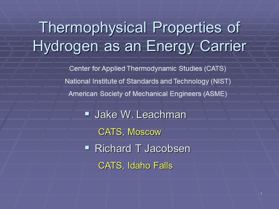
I had been tasked with developing a slideshow template for the Center for Applied Thermodynamic Studies (CATS). After giving it the old student try, my advisor suggested I just pick a standard template with a nice blue background. I’ve shown the slides full page-width here to fully emphasize the un-used space on each slide, which my advisor enjoyed for simplicity. Did I mention this was at the IAS meeting in 2006? You wouldn’t know it from the opening slide. Why are NIST and ASME listed on the front slide? I can’t really remember. If you really want to see how bad it was here’s the slide deck: IAS presentation. Here’s one more slide from that talk:
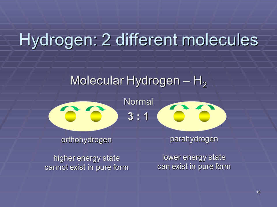
To make matters worse, I got clever with this slide and animated the hydrogen nuclei to spin in opposite directions for one form and the same in the other. I can still remember people groaning in the audience when the animations turned on. Thanks PowerPoint. I’m convinced that 95% of the features in PowerPoint should never be used. Moreover, the only time it should be used in teaching is to teach people how to create a PowerPoint.
Surprisingly, I actually got quite a bit of engagement after this and subsequent talks. I’ve wondered about this for many years. My conclusion is that it was what I’ll call the ‘cute puppy effect’ — there is a certain draw to something young, totally awkward, yet innocent that you just want to help correct and complete. I had incredibly patient mentors.
Although it may not seem apparent, in these early years, my focus was actually on slide design and entirely missing the point. I’d have to wait until the University of Wisconsin to figure it out.
Dr. Traci Nathans-Kelly taught the EPD 597 Technical and Professional Communication class. It was here that she first pointed out the significance of relevance to the audience. If your visual is not what or where the audience expects to see it, it’s not in the right place. This is likely the origin of relevance as my first rule for engineering communication.
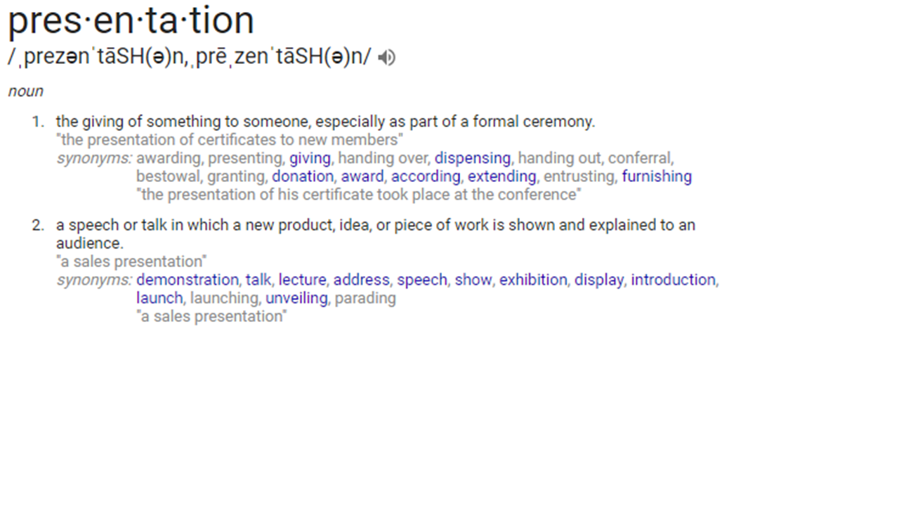
Looking back through my EPD 597 course files, I found a number of hints as to why relevance, credibility, and efficiency became my three rules of engineering communication. My course project was making skimmable content (efficiency). Here’s an interesting test from that presentation. I’m about to show you a picture. You are supposed to look at the picture and identify one of the first objects you see.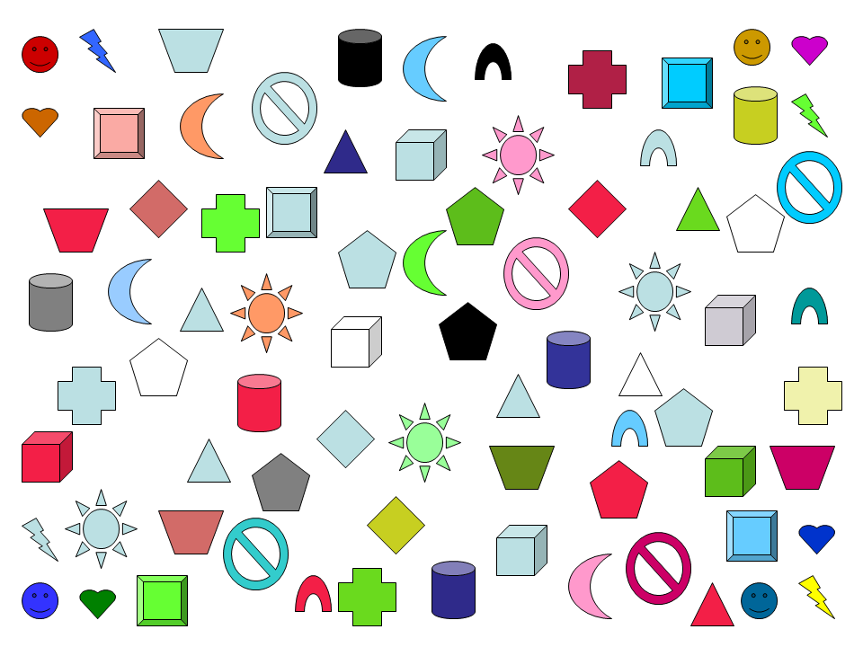 Ok. Now that you’ve locked on to a shape, was it within the following area of the image?
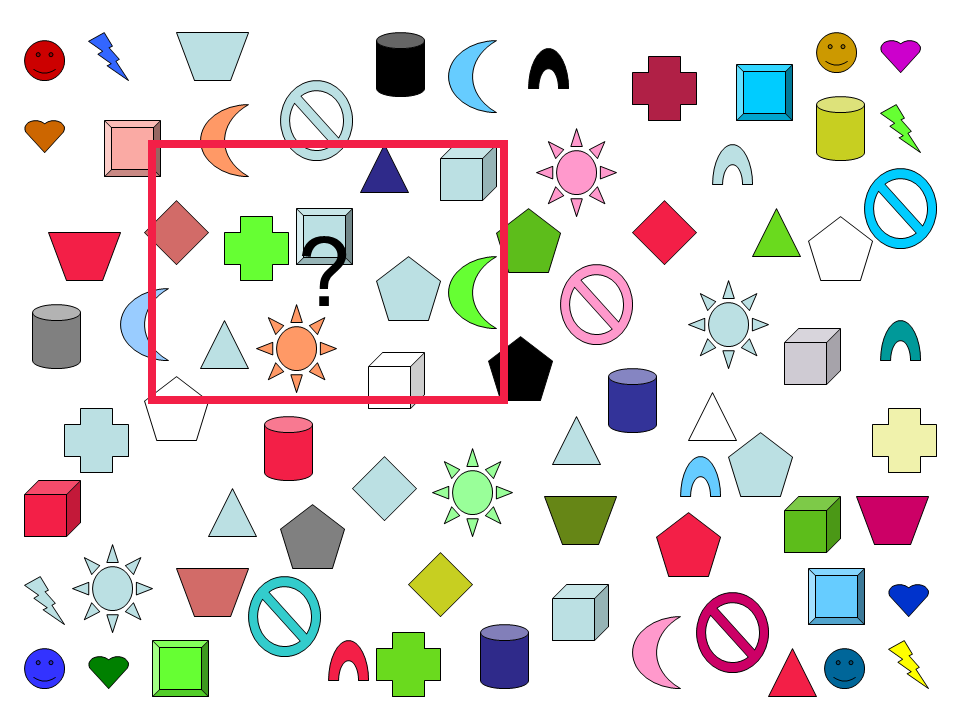
Even though that square contains only a small fraction of the shapes in the image (~1/5), the majority of people in Western cultures will lock onto a shape from that small portion of the image. This is because Western cultures read top to bottom, left to right. It’s what is know in the newspaper and visual media world as the stress-point. It’s where an audience statistically tends to enter a new form of media. Understanding this natural tendency of your audience is a convenient first step towards designing visuals that give your audience the relevant information they need to see, where they need to see it. The next steps are when and why.
I can thank my co-advisor at Wisconsin, Greg Nellis, for helping me to understand the when and why. Greg helped to shape my thesis into 5 key content sections: 1) Intro, 2) Literature Review, 3) Theory, 4) Experiment, 5) Results and Conclusions. Although I don’t remember him explicitly making the connection for me, I soon realized that this is the natural story arc of most experimental research programs. The entire point of presentations and research reports was, indeed, simply telling the story of what happened! The entire point of visuals is to supplement key points of your story arc! (For more on this read my post on the power of story.) If the entire point of visuals is to supplement what you are saying, it makes sense to show the audience only the information they need to see, when you are in the process of saying it. You can control what your audience is looking at by layering your information on a slide. Take, for example, the following slide progression:
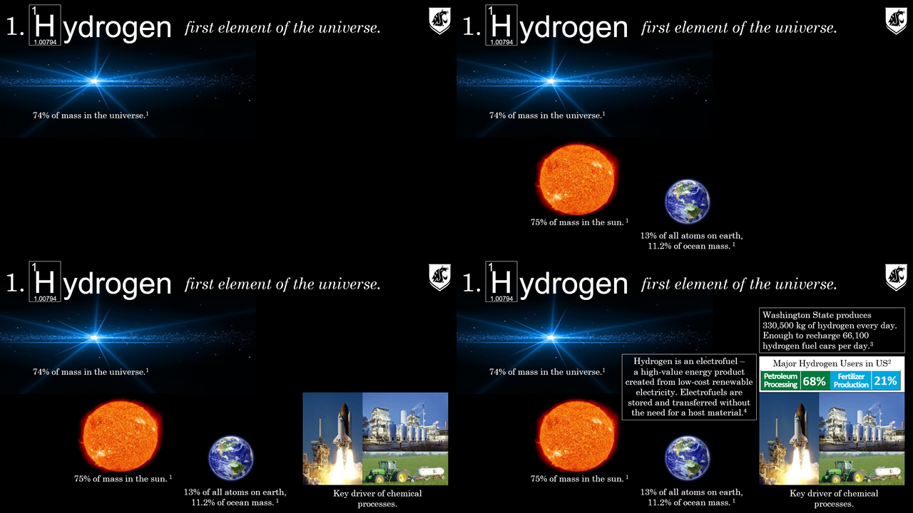
I use this slide progression to introduce a nebulous concept like hydrogen and bring it down to earth (even back home) for the audience. I don’t overwhelm my audience with a slide as busy as the bottom right corner by controlling when the image appears within the progression of my dialogue. But at the same time I’m able to include enough information on a slide to make a complete point — a progression. By the end of the slide the audience implicitly gets the point of the slide and can actually see the process for how we built up to that understanding. I advocate a similar approach for designing effective posters.
With this basic understanding of relevance, credibility, and efficiency complemented by who, what, where, when, and why that I left my formative education years and moved onto a tenure-track academic position.
The first decade as a faculty member
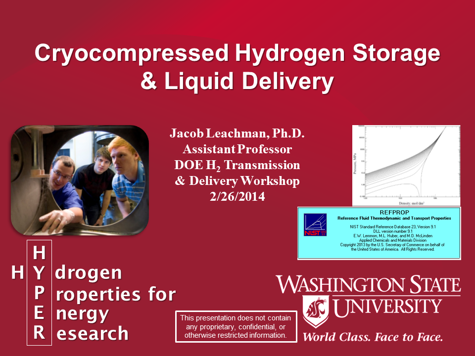
Just because I knew the basics of giving a good presentation doesn’t necessarily mean I was proficient — it takes considerable practice. For several years I struggled with overdoing slide layering such that my presentations were awkward or did not transfer between computers well. Here are a couple of examples from early 2014:
You can see many changes from this title slide to my first from 2007. I’m at least using the standard university branding, color themes, and fun pictures. But I’m still struggling with the relevancy of content and efficient organization. Here’s a non-title slide from the same presentation:
I’ve at least got a system for the slides that conveniently includes information such as slide number, university and lab name, date, workshop name, my name, etc. This content is essential for people taking photos during your presentation or trying to recall specific content from a particular slide. I’ve notice my slides have significantly more original pictures with smiling faces in them and much less text — primarily only statistical points that would be difficult for me to remember if not placed on the slide. From a visual standpoint though it’s very clear now that I was trying to do too much with too little space. Even though I layered the presentation of this slide, everything is cramped.
In 2015, WSU nominated me to give a CleanTech Alliance talk at the Rainier Club in Seattle. Around that time my slides started trending towards simpler color combinations and designs with very clear topical transitions. Here’s the title slide:
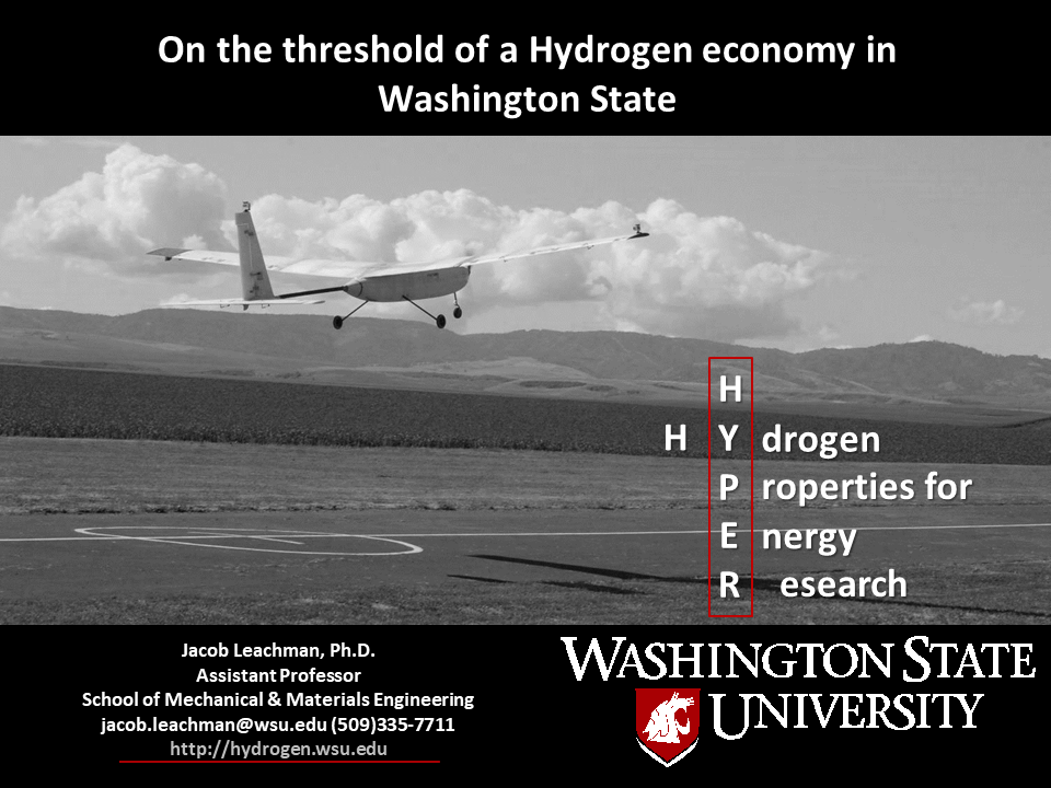
It’s easy to forget that the title slide is often in front of your audience longer than any other slide in your presentation. Make sure you have the key info where your audience needs and wants to see it. During this talk I impressed some folks enough to get follow on presentations, most notably a GoogleTechTalk and the Jefferson County CleanTech Symposium. In 2017 I was invited to Trondheim in Norway to give a consecutive 2 hour presentation block to SINTEF and the Norwegian Technical University.
2018 was the year I really started to perform with presentations, after over a decade of practice. I was confident enough in my talking points, poise, and presentation materials that I could improvise talks. In May of 2018 I volunteered to give a SciencePub lecture at the Paradise Creek Brewery in Pullman as a fundraiser for the Palouse Discovery Science Center. SciencePub typically pairs faculty from disparate disciples with the intent to create uncommon idea collisions to seed innovation. I was paired with Squeak Meisel, the chair of the Fine Arts department, infamous for an art piece where he put on a giant panda costume and ran around Pullman for a several week period. Definitely out of my comfort zone. Squeak’s art tends to revolve around Tao dualism — the yin-yang. As we talked about our works, connections started appearing and we sketched out a script for a fun story. Our talk, “Let’s Fly in a Flammable Bubble” utilized a white (Squeak’s) – black (my) slide progression where we would hand the mic back and forth to show the commonalities between our work, and fit the yin-yang theme. Here’s a subset of the slides:
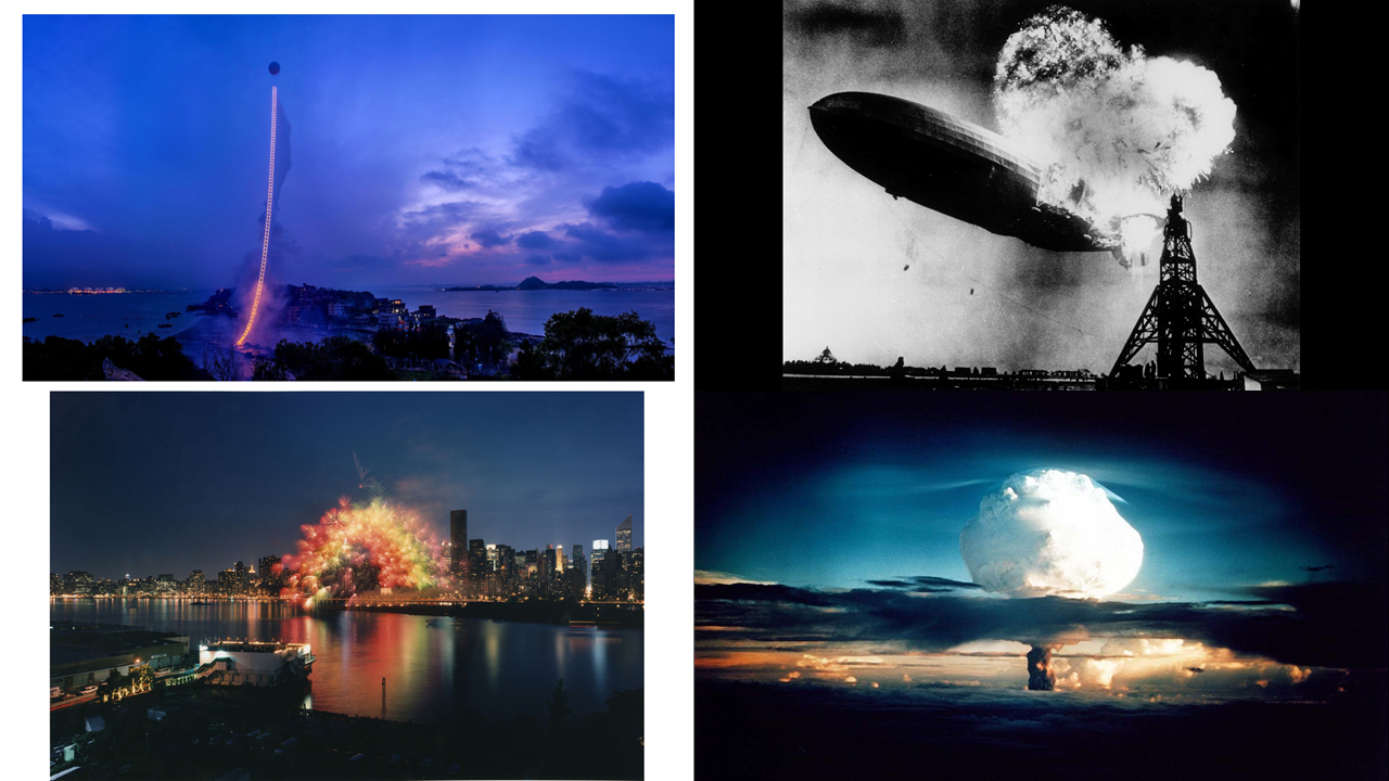
You can see the interplay and duality between the art and tech world — which was the grand point of the talk. Getting out of my comfort zone with this talk helped me to rethink my slide design — specifically around the interplay between visuals and text.
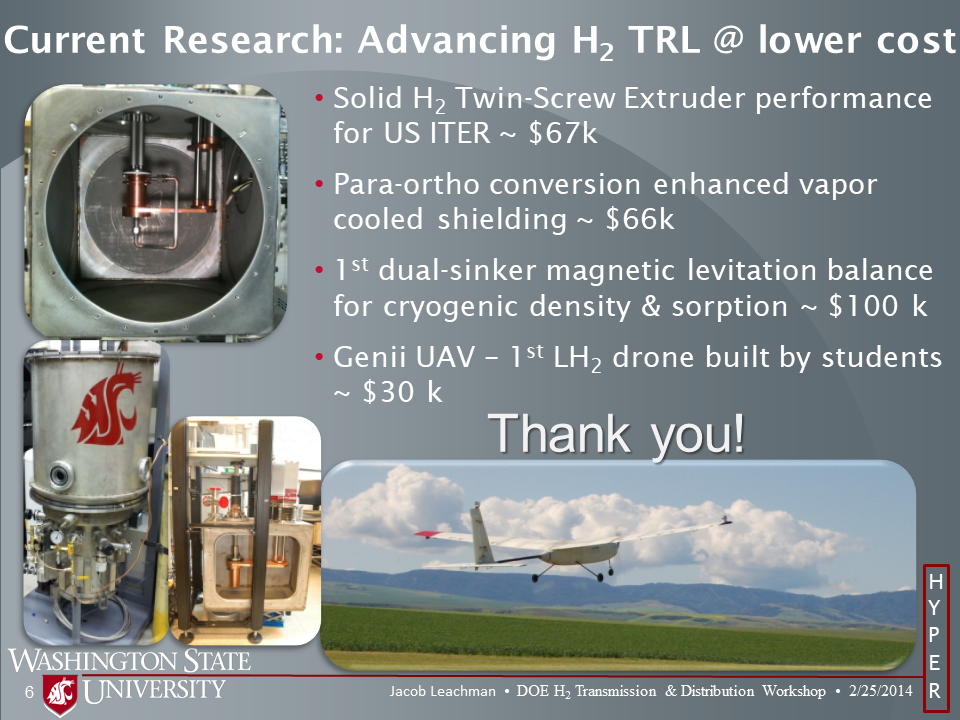
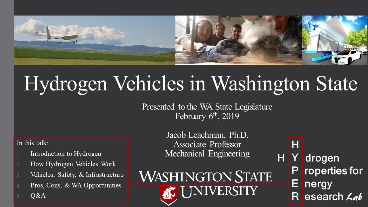
2018-2019 involved many high-level talks to VIPs. I was requested to testify to the Washington State Senate Transportation subcommittee on hydrogen vehicle technology. You can watch that presentation here. You can see the progression in visual design towards more color, actual use of visuals as a progression, and smiling faces:
You can see the clean color scheme, a banner of fun and relevant pictures from my lab, the simple outline in the corner, etc. Here’s a slide from within the talk:
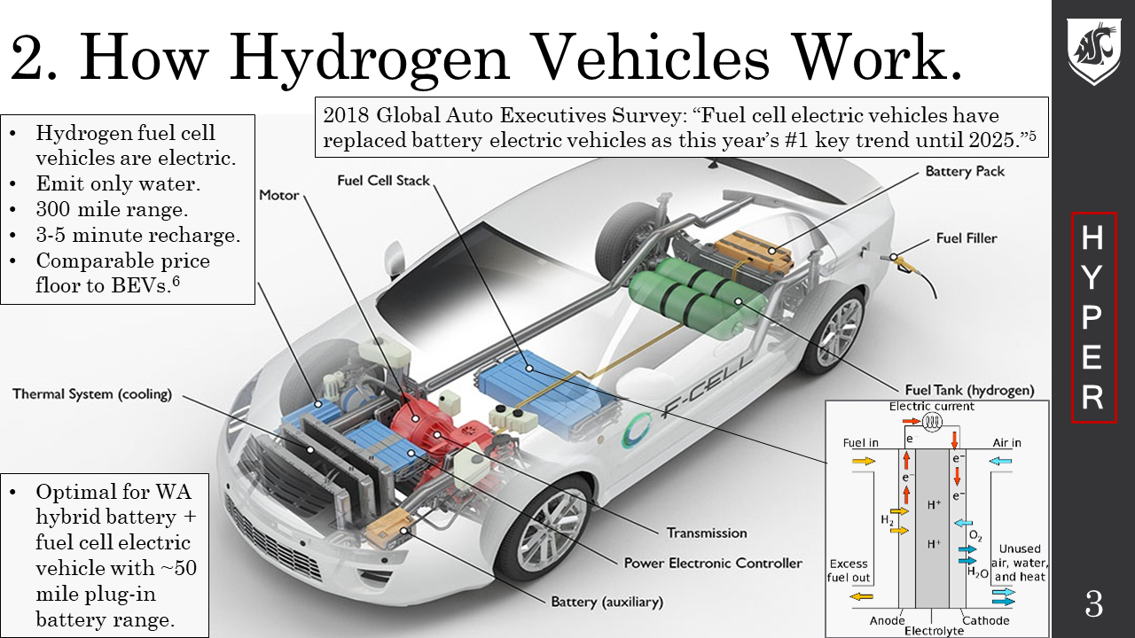
You can see I transitioned to the efficient side banner that matched the simple color scheme. When things are simpler they don’t appear as crammed together. The islands of text on the slide can appear when I am talking about those points. Notice that the entire slide format is now more poster-like. It’s clear what the point of this slide is and what information someone will have once the slide is finished. This slide design became a template that many in the lab would use. With many more people in the lab using these visuals they naturally began contributing to the design of the visuals.
The HYPER logo you see in this slide was created by Ian Wells when he was a freshman. I loved it because it worked with hydrogen in multiple ways — it looks like a proton with a circulating electron in the Bohr model of the atom, or it could be a moon of a planet, or maybe even the Death Star. Regardless, once we used it, everyone started identifying our work by that logo and we were stuck with it. What you also notice in this slide design standardized space for visuals. Every person utilizing this slide template changes the visual(s) to reflect images from the particular project being discussed. So we’d figured out a community standard that still allowed customization for each project/group. This also carried forward into the individual content slides.
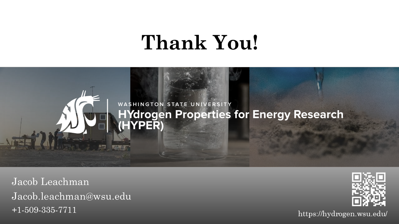
The right hand banner needs to appear on each slide as people will attempt to just take pictures of your slides to reuse them. Although this banner was originally WSU grey, one of the students took a still of a bubbly liquid hydrogen flow where we could see the bubble reflections on the liquid surface. These bubbles and reflections looked enough like diatomic hydrogen, and related to the work we do studying hydrogen enough, that these became our standard banner. We can also place text along the black edge of the HYPER logo to state whether the slide content is approved for distribution.
Notice through these slides a continuous improvement in our visuals that are original to us. Even if someone doesn’t understand what we’re talking about, they can see the passion and thought we put into our communications.
One last thing, don’t mess up the ending. We’re hardwired to respond to “Thank you!” by clapping. Everyone is trained to ask questions then too. So don’t confuse us by asking for questions, flashing references at us, or telling us we’re supposed to clap at the same time. Just say “Thank you!”