I was a first year Ph.D. student when I created my first original research poster. In engineering we’re always surrounded by these posters attempting to communicate our research as they are akin to wallpaper in the common hallways. That’s why I spent way too much time on it. I was so frustrated with how typical and common the legalistic design meme of these posters was that I wanted to break the mold. I wanted to create a visual that would stop people in their tracks outside the lab and stand alone, i.e. would tell the story without me having to be there, to appeal to the majority of viewers who would walk by the poster. Anyways, here it is:
I remember when I first showed it to my two advisors, and in classic form one of them liked it a lot and the other hated it. The one that disliked it had been a poster judge in many design reviews and said that I did not follow the usual format (meme) that had islands of important content laid out in a linear fashion and that my approach is excessively wordy thereby requiring considerable time to work through. My other advisor jumped in and complimented on the flow of the visuals, similar to the flow in the extruder, to draw the viewer through the story from start to finish while simultaneously culminating in the important result. When I presented the poster at the 16th International Cryocooler Conference Peter Gifford, the CEO of Cryomech and the patriarch of the conference, in reference to my poster said to one of his colleagues, “that’s an incredible f***ing poster.”
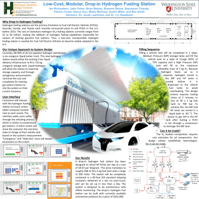
Since then I’ve come to respect poster design for what it says about a person’s use of resources and information flow meme set. Effective visual design STARTS with lots of quality media resources that can draw a person into a story, to help them connect with the work. Take for example the poster the lab made for the 2014 Hydrogen Student Design winning submission:
This poster won the “People’s Choice” award at the Cleantech showcase last year. Patrick Fromme from the U of I was on the team and was skilled with visual design in Rhino from his training as an architecture student. The visual graced the front of the report and became a central theme to all of the competition’s marketing. The colors says this is clean and earth friendly, the shipping container with movable cover says this is portable and modular, the car says it’s high tech and cutting edge. Frank Oppenheimer is widely known for describing art as, “only valid if it corresponds to a plausible human experience.” The same can be said for design. Rounding the edges of the image is similar in shape and color to the earth or an eye.
What is really incredible about the poster development process though, is that you start with a blank canvas. As such, Conway’s law plays a major role: “Organizations which design systems are constrained to produce designs which are copies of the communication structures of these organizations.” Not only does this apply to organizations, but it also applies to the information flow memes dominant within an individual. It’s no coincidence that the majority of research posters we see contain balkanized nuggets of information within a linear flow progression— they mirror our current educational system!
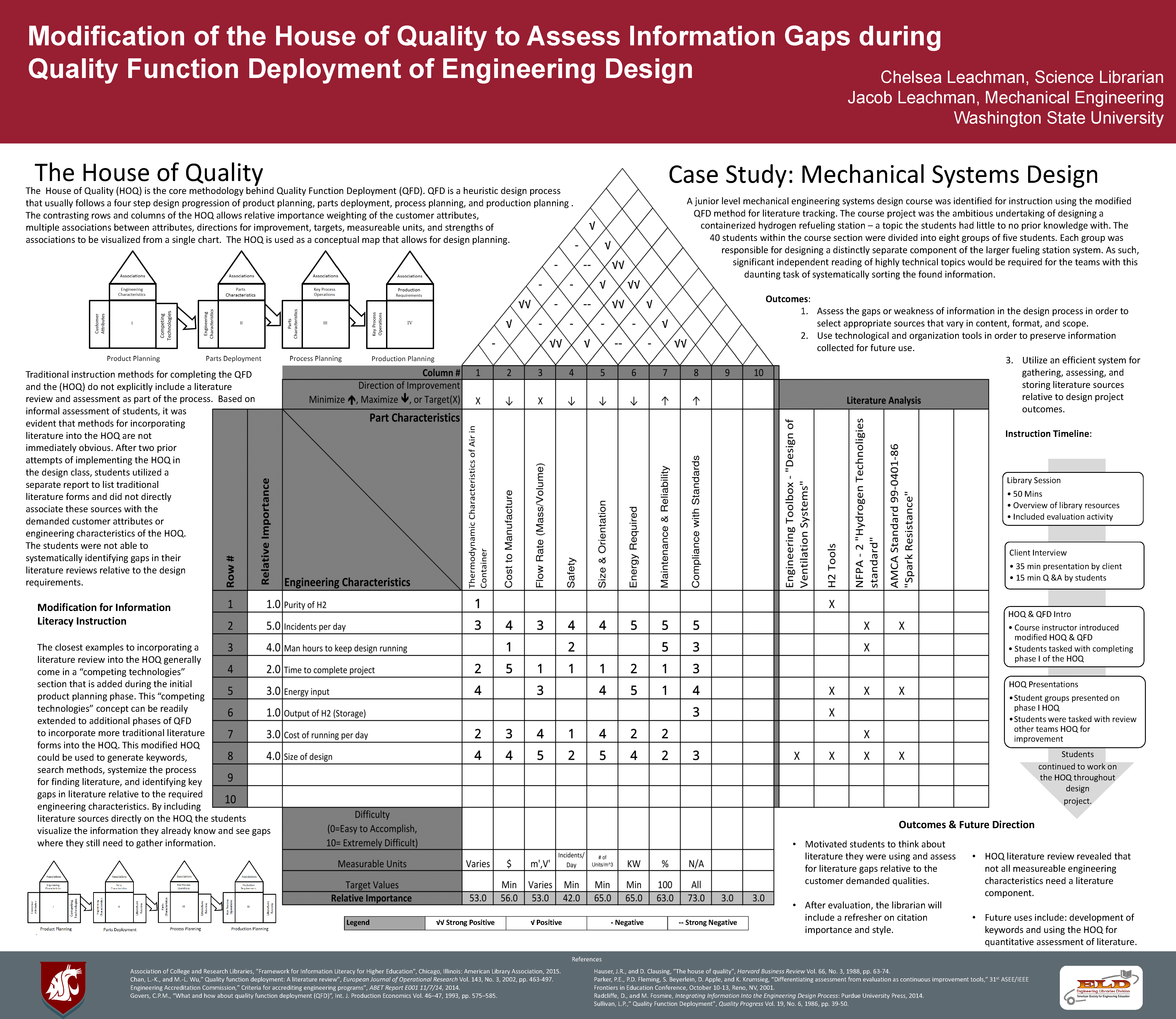
Here are a few more poster examples developed since this original posting. This poster won the Best Poster Award by the Engineering Libraries Division at the ASEE conference in New Orleans.

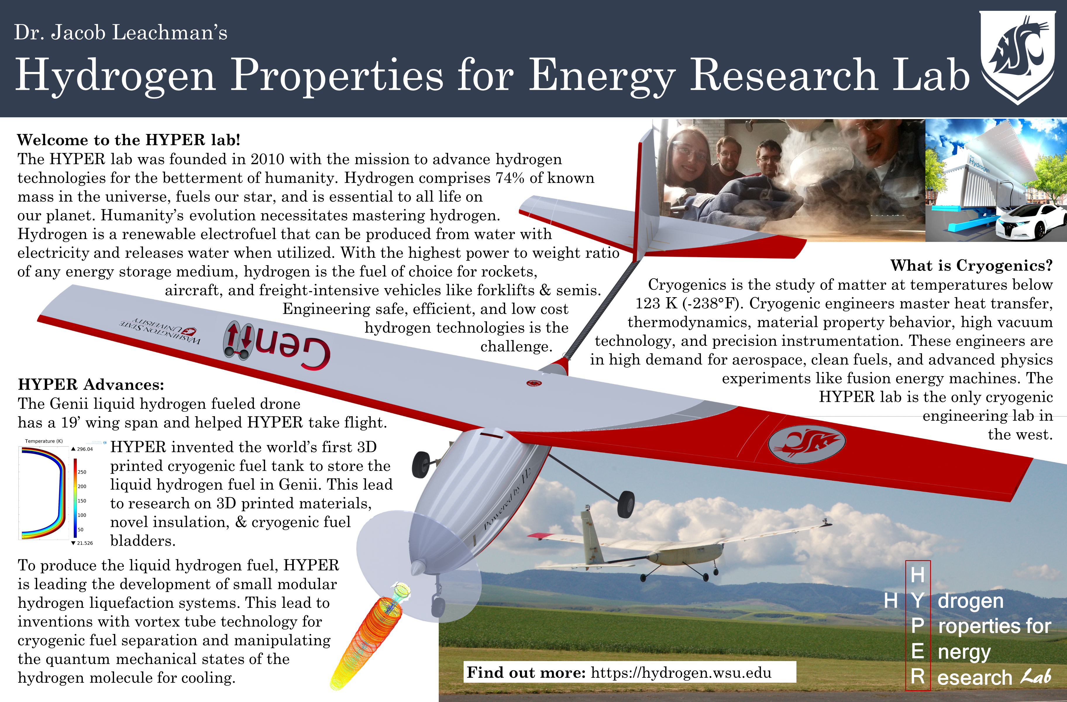
The next poster was developed to present the lab in the MME hallway.
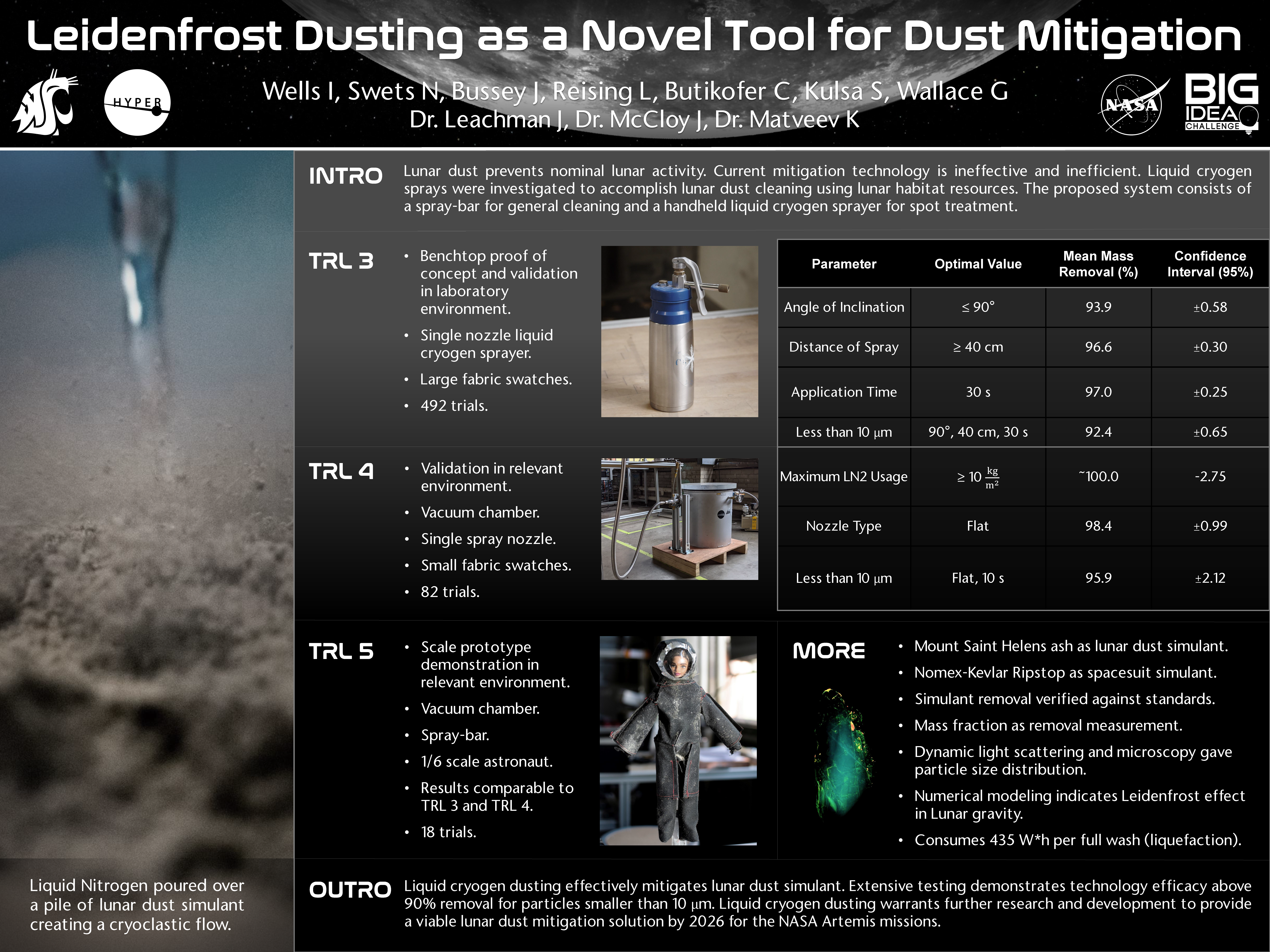
Here’s another from the 2021 NASA Big Ideas Challenge:
Notice the key theme remains — find a good visual to form the spine of your narrative (and work), then build from there. More information on the design of presentations is available here.


