It took 10 years for me to start calling the HYPER laboratory a community. In one month we’ll have had a website for six of those ten years. In many ways those first six years were much like the six year tenure process we follow as faculty. While we’ve continually added content (>300 posts and >75 pages) within our core themes of Research, Teaching, and Service, we’ve never really sat back and thought about how to make the site truly great. This post tells the story of how the site evolved, from starting as one of the ‘guinea pig’ sites my neighbor friends (Steve Locker and Jeremy Felt) convinced me to start within the new WordPress multi-sight spine system they created for the WSU campuses, my random generation of content over the years as I found my voice, to re-engaging with Steve and Jeremy who are now co-founders of the HappyPrime web company. With any luck, after reading this post you’ll be able to start your group’s website to facilitate outreach to your audience more effectively.
My first post, “Introducing HYPER Laboratory Online” still resonates with me today — I created this site to tell stories. But in the middle of the peak stress of the tenure process, the system for organizing the site quickly merged with that of the tenure process into the default Land-Grant categories of Research, Teaching, and Service. In many ways I viewed the website as a modern incarnation of my Curriculum Vitae with a search bar. The site was about me and another way to get my act together. Outside users of the site were an afterthought.
The posts I wrote eventually started telling a different story, one that is true to me. Throughout my life I’ve always gravitated towards the role and need that were not being fulfilled by others. In those early posts you see many celebrations and frustrations. This is probably a phase that many seem to go through when new to social media. But what eventually emerged after those early posts are myself mostly trying to teach and mentor things you can’t teach in the classroom or through journal publications, which you don’t see being taught within the university systems. In short, many of the posts were about lessons I had to learn the hard way that I hoped others would not have to repeat.
The need to rethink the website culminated this year with an influx of new community members. Although many graduate student recruits spoke highly of the website, the freshman and sophomores comprising the Core team of the community told a different story. There is a certain freshness, innocence, and honesty to the Core team and they had little reservation pointing out their experience trying to learn about the HYPER community through the website. Earlier this spring, those same Core Team members drafted “Professional Practice: A Compendium for the HYPER community” and quickly realized that the website would need to change to reflect the new Compendium. Those inaugural Core Team members — Hannah Gardner, Ian Wells, Chase Phillips, Nathaniel Swets, and Lauren Reising — are the protagonists of this story. Not only are they totally new to web design, they are new to the lab and the engineering process. Which is why they are perfect to deliver this story to you.
The Website Design Process
Website design processes are directly analogous to engineering design processes. These processes are enumerated below:
- Introductory Mission, Vision, and Goals
- Background SWOT, Aspirations, and 6S
- Theoretical Structure
- Implementation
1. Mission, Vision, and Goals
Mission: What’s your Group’s fundamental purpose?
I always find it revealing when reviewing the cover letters of new faculty candidates — these are the most over-looked item in the entire application packet. If you can’t provide a pitch for your mission and goals, and why they need to happen specifically here, then I’m not interested. But somehow academia has lost site of this business mentality. From the homepage of this site:
The mission of the Hydrogen Properties for Energy Research (HYPER) community at Washington State University (WSU) is to efficiently advance the Technology Readiness Level (TRL) of cryogenic hydrogen systems for the betterment of humanity.
This mission needs to be simple (<22 words, when you use the acronyms above we’re right at 22), specific enough to be credible, yet encompassing of all that you do now and into the future. This mission needs to relate to the broader institutional goals (WSU’s grand challenge themes of sustainable resources and national defense) and the broader needs of the region (excess electrical power and Aerospace companies in Washington State). Most importantly, this mission needs to direct the actions of the people working in your group on a daily basis towards fulfilling our eventual vision.
Vision: What does your Group hope to achieve?
Visions are often thought of as “Blue Sky” — if all of our challenges were suddenly gone, what would the world look like? It’s hard to have visions that are both desirable and recognizable, yet ambitious enough to guide over the course of a career. Although everyone generally wanted to work towards bettering the world through sustainable renewable energy, we had not defined our vision on this site until now:
Goals and Values: What does your group actually care about and/or do?
This is where I align the above mission and vision with that of the Land-Grant institution:
2) Teach the future professionals who will realize this vision.
3) Service the nascent industry and stakeholders who will rely on this vision.
2. Background SWOT, Aspirations, and 6S
Strengths, Weaknesses, Opportunities and Threats (SWOT)
The Core Team was instructed to list Strengths, Weaknesses, Opportunities, and Threats (SWOT) for our site and community.
Strengths:
- The content is valuable, good blogposts.
- Good traffic/clicks from blogposts.
- Images that we have available (on and off the website) are really valuable.
- Jake has good networking in STEM community.
- Does a good job of showcasing what we do.
- Our navigation bar hits all 3 goals.
Weaknesses:
- Organization is poor.
- Difficult to read due to lack of headers.
- A lack of or too much information in some places- imbalance of information.
- Difficult to find information/navigation.
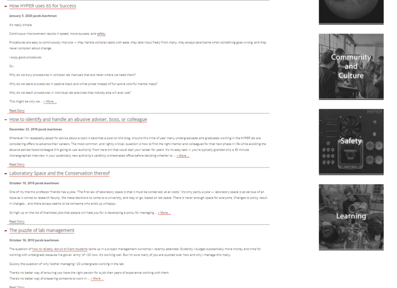
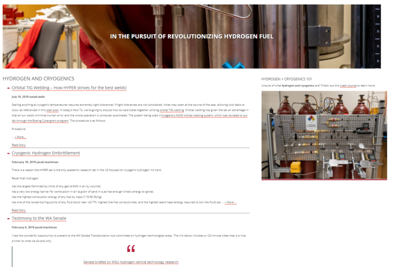
- Inconsistent design- some pages have more captivating design than others.
- Hard to flow between pages- nothing prompts you to continue reading/learning (little to no serendipity).
- More pictures, maybe need a gallery.
- Hard to find purpose of lab.
- Hard to find desired blogpost because of layout of page.
- News page hasn’t been updated since 2017.
Opportunities:
- Display content and news posts prominently and choose words that people will search.
- Emphasize more on the people behind the research.
- Educate people who didn’t know about what the lab does to increase funding, traffic, etc.
- Blogposts bring great opportunity- retitle so they use words that people search.
- Link the posts on the right-hand side of the home page to the news page so that people will be naturally brought to the news page and may want to learn more.
- Use “teaching” tab to emphasize what the lab can teach instead of just what Jake teaches on his own.
- Offer class tours for local schools or for university classes to increase community involvement and prevalence (Service or teaching?)
- Cover professional practice with Compendium, training, how we use Lean, etc. to increase credibility of lab members.
- Show more of our lab culture- it is a big part of who HYPER is.
Threats:
- Bad organization leads to decreased interaction
- Difficult to make it through content, because too much is going on in text. People don’t want to go through website.
- Overwhelming amount of information being thrown at the reader. Need to be eased into the website.
- Home page in general- not eye-catching, people aren’t likely to want to read it all. “Thanks for visiting” turns people off, makes it feel like the end of the page.
- Confusing the user and turning them away with: a. Too much cluttered and disorganized information in some places, b. Not enough information on some pages, c. Hard to navigate.
- Focused on one audience: graduate students and professionals who are well-informed on the subject.
- We ask for donations, but we give no reason to donate. Don’t emphasize on green fuel or roles of hydrogen.
- Confusion between lab and experimental facilities in headings.
- Current research is hidden deep in subcategories, hard to find.
The simple honesty of freshman and sophomores is awesome…
The real threat to the HYPER community was exemplified just last year in 2019 when NASA awarded a multi-million dollar grant to the University of Illinois Urbana-Champaign to help develop trainings for students to design liquid hydrogen fueled aircraft. Nobody on the lead PI group had experience with liquid hydrogen — kindof a big deal. So when they were announcing this grant at the Cryogenics conference, I asked who they had on the team with liquid hydrogen experience. Of course they pointed to someone who was in my short course on liquid hydrogen the day before…. Honestly I think they didn’t even know we existed. The real threat is then either not being found or being viewed as a threat to others. But really, how could we be a threat when the field is this small?
Aspirations
The CORE Team was also tasked with identifying websites both in and outside of WSU that they enjoyed viewing OR using. Here’s the list in random order: General Fusion, LIGO, PNNL, Foreign Family Collective, Tesla, Blue Origin, Boeing, Paul’s Online Notes, Apple, National Geographic, Atlas Obscura, and Wikipedia. So it’s clear they have expensive taste.
Sorting everything via 6S
I tasked the team with conducting a 6S event of the posts on the website. 6S is a philosophy of organization from lean manufacturing that we regularly employ in the HYPER community. Whenever entering a new space that is out of order, the most efficient way to organize is following the six Ss: Sort, Systemize, Sweep, Standardize, Sustain, Safety. Usually sorting occurs into colored bins: red (throw away), yellow (ask questions), and green (keep). Steve made the great point that websites should never be weeded as the information accurately reflects history and the group’s mentality at the time, for better or worse. So we had to develop new bins. The Core Team was tasked with coming up with their own minimum number of bins as post themes they thought were fundamentally differentiable. They started by sorting the top 20 or so most popular posts on the website:
The important thing to remember is that traffic is not the point of a website in the university — we can’t sell adds on the website. The important thing is understanding our audience to make the right, quality connections, and pageviews was our easiest approach. From this data it is clear that the majority of the website users want to see information on hydrogen safety and our tips and tricks for making cryogenic hydrogen systems, with some sporadic interest in thoughts for explaining random things like football.
With these bins in place for sorting the blog posts, it was time to see how these bins would relate to and reinforce the navigation structure of the pages on the site.
3. The Site Structure
Blog Post Bins
The team settled on the following bins, which resulted in site categories for tagging blog posts:
Whether the How-to bin remains apart from Hydrogen and Cryogenics remains to be seen. What this structure allows us to do is quickly tag each blog post by the site category that it should appear in. We can then place these site categories in the appropriate pages in the navigation for people to efficiently find similar content on a topic.
Page Navigation Structure
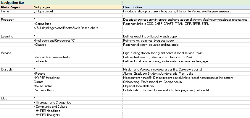
In parallel with the blog binning process, we debated on the page navigation structure. The original (Home, Members, Research, Teaching, Service, How to Find Us, How to Help) was not structured to welcome new users to the site and help them navigate within a logical flow (to them). With considerable help from Steve we modified and simplified the original structure into the following:
Note that it is not essential for the blog posts to mirror the site navigation structure, but we do have points where the two connect. The big changes here were to 1. simplify the second level, 2. create a branching structure from the homepage (notice that the number of second level headings increases as we move away from the homepage), 3. Move the information about us to the end as people will only want to know that if they are in-line with the content that came before, and 4. Add a first level heading to aid in navigating the Blog content.
I found that it was absolutely essential for the Core Team to come up with the titles for the headings — they are closest to the mental state of our target audience.
4. Implementing the new structure
Once the new structure was created, it was as if the damn floodgates opened. Everyone was racing to restructure the site content. Around this time something incredible happened with the Core Team — they started really performing as a team. Everyone was engaged, contributing original thoughts, and taking action. Watching a team begin to perform as a whole gestalt system is one of the most amazing and rewarding things to watch in all of humanity.
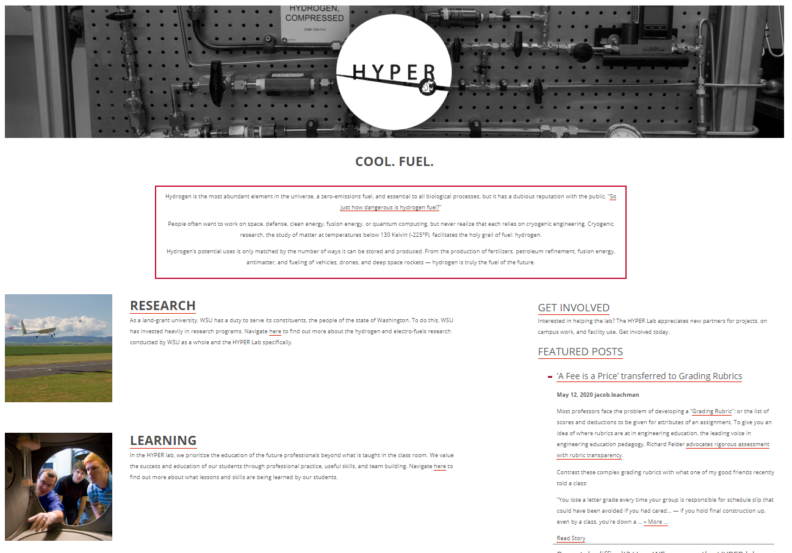
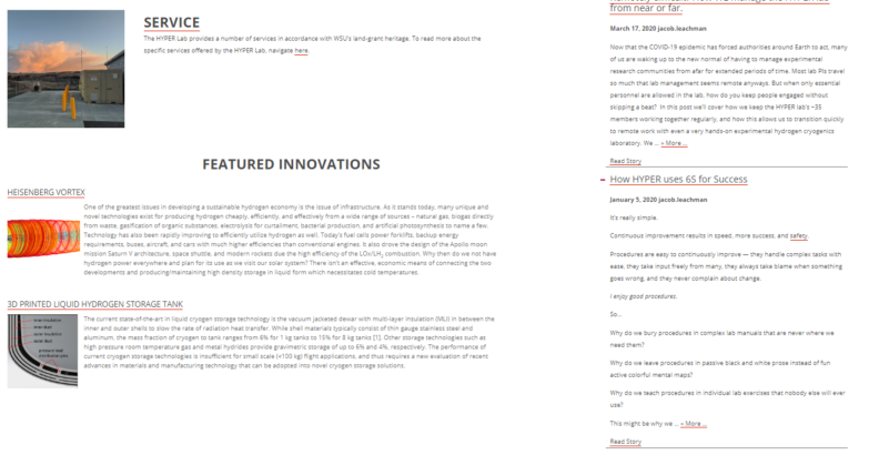
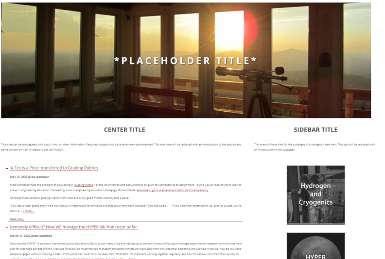
Several designs for level 1 and 2 templates were created and iterated with the desire to connect more things, more simply. Hannah Gardner expanded on her use of memes in the Compendium to create beautiful images with descriptive and invitational links. Ian Wells, Chase Phillips, and Nathaniel Swets went with a tile system that combined a colored image with a descriptive word for navigation.
We came up with an approval process for changes to the site — Core Team approves, Steve approves, I approve, change is made.
We realized that we just needed to start making the changes in piecemeal fashion rather than having a big release. We started by changing the structure, then implementing the templates starting with the homepage and working our way down through the tree. We kept a checklist to make sure we were not leaving any parts of the site behind. We knew this process could take all summer.
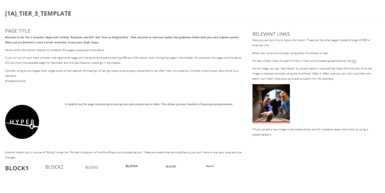
Here are some of the concepts that led to the final design.
| Home page: | Tier 1: |
| Tier 2: | Tier 3: |
And after just about a month, we’re close to 80% transferred over into the new structure.
About week three into this the Core team (Hannah Gardner, Ian Wells, Nathaniel Swets, Chase Phillips, and Lauren Reising hit their stride. It’s magical when a team achieves a gestalt level of performance, and contagious too. My bet is they’ll strive to recreate the experience with their future projects.
Results
By the time you’re reading this, the site has already been changed over. While it’s difficult to track statistics, as they vary from month to month and COVID-19 likely is playing a factor. What we can see though is that since the main page started changing a month ago the number of site users is up 27% and the number of pageviews up 63% from the previous month. I’ll be curious to compare the differences one year from now.
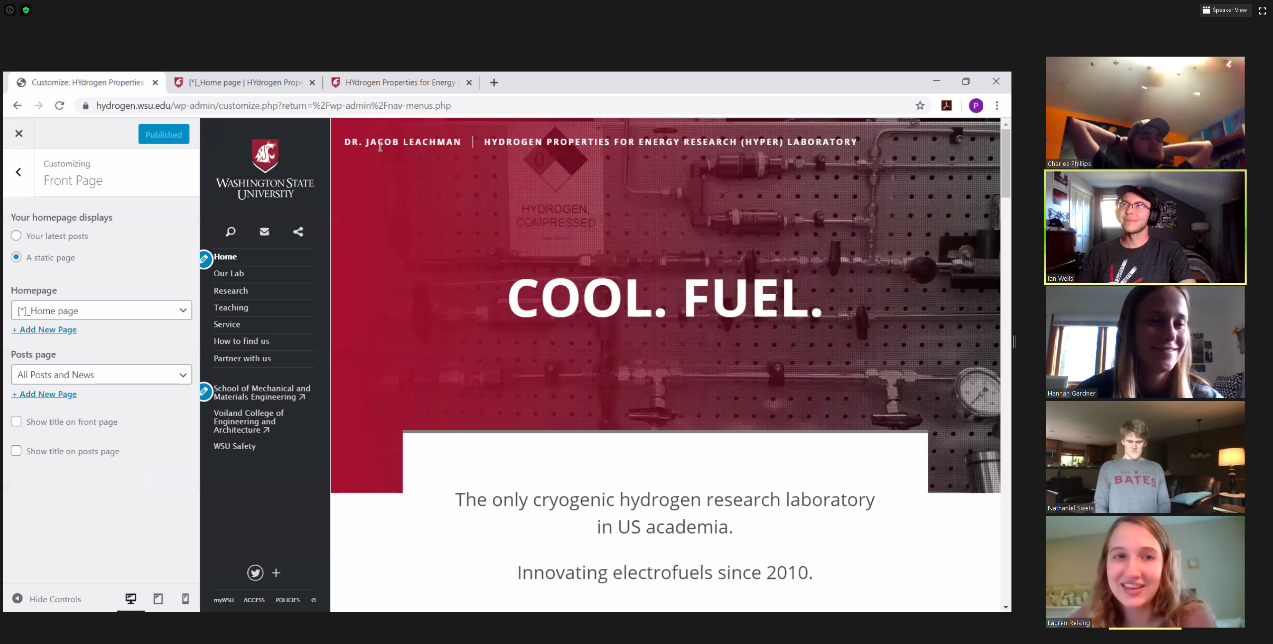
What I can say is that the folks at HappyPrime know what they are doing. I cannot recommend them more if you are setting up an important university webpage. The Core Team loved working with them and vice versa. New beginnings are always fantastic!


